
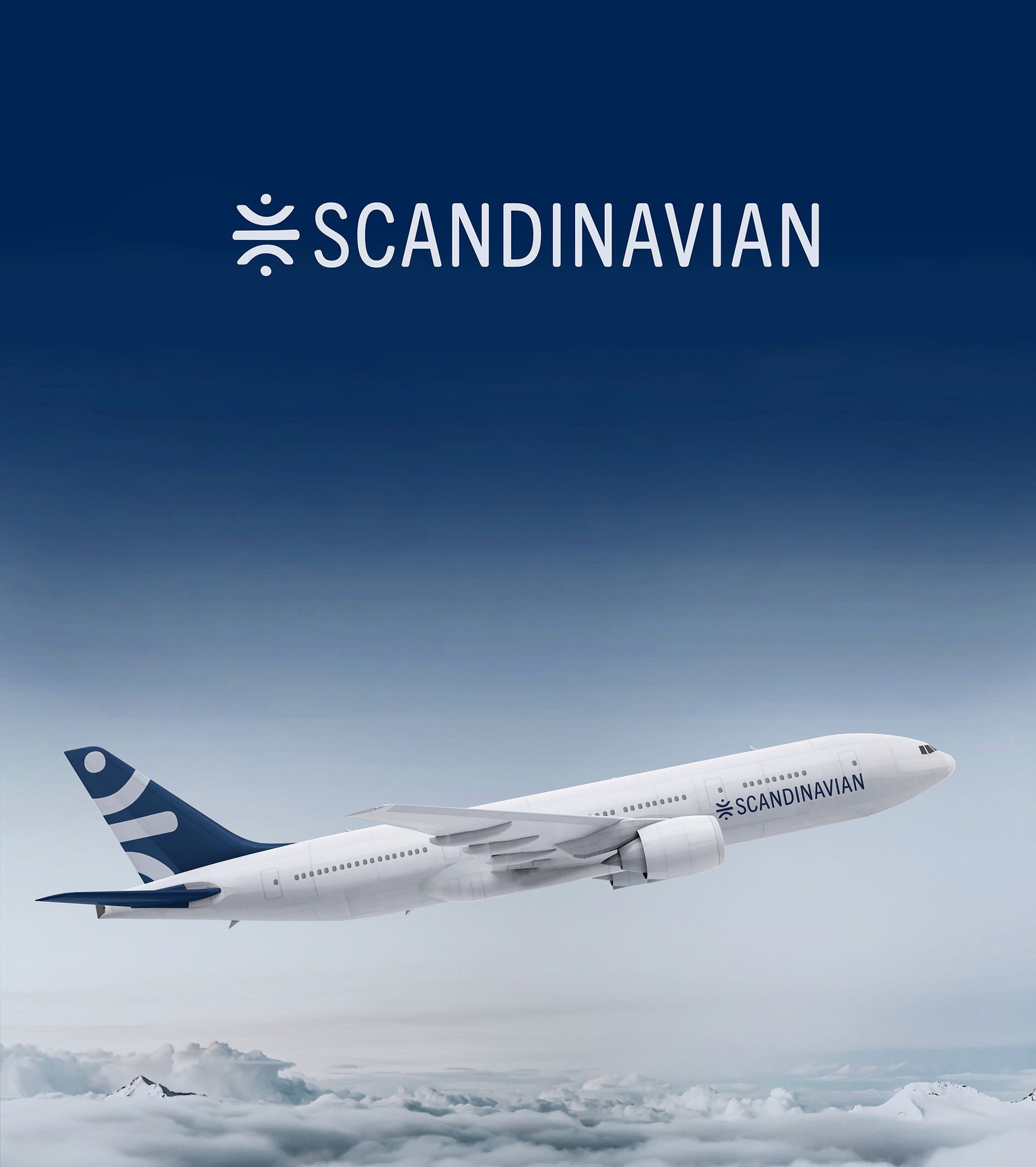
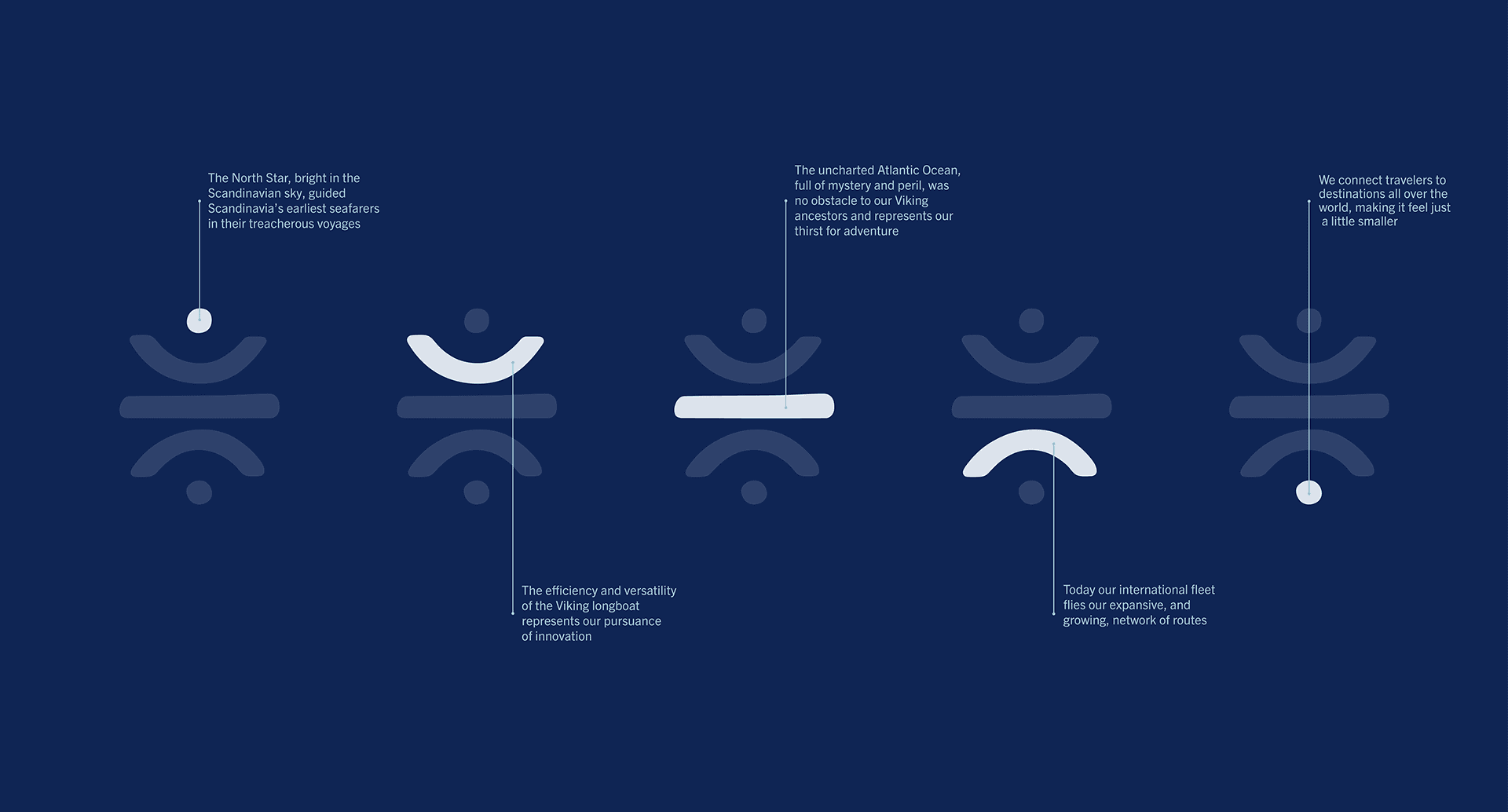
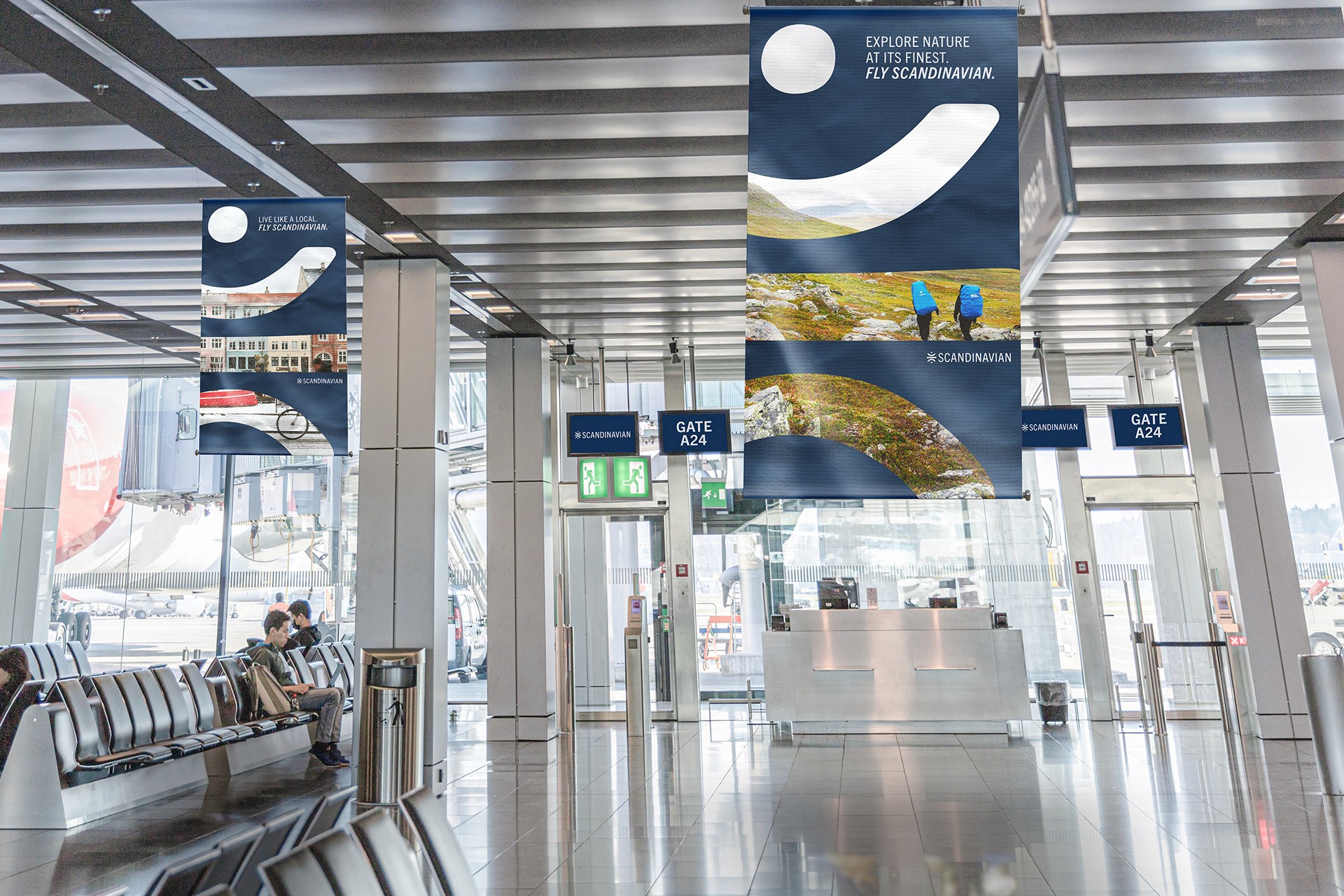
Scandinavian Airlines Rebrand
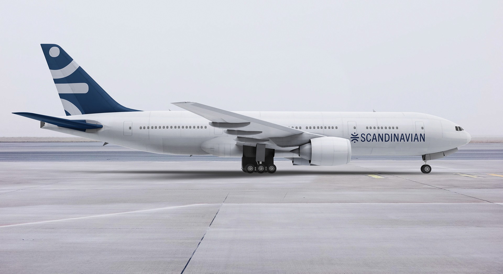
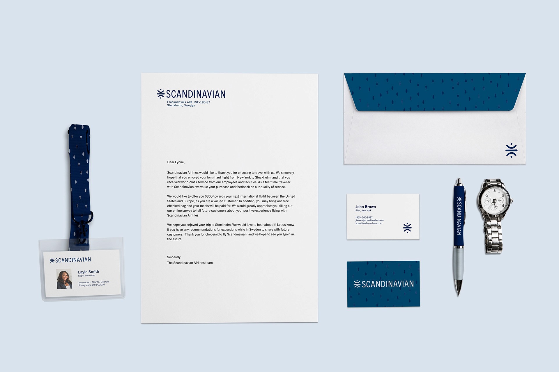
This rebrand of Scandinavian Airlines modernizes its visual identity while staying true to its Nordic roots. Clean design, a refined color palette, and minimalist typography come together to create a fresh, sophisticated brand that reflects the airline’s values of quality, sustainability, and effortless travel.


Conclusion
These designs breathe new life into Scandinavian Airlines’ visual identity by blending modern minimalism with elements deeply rooted in Nordic heritage. Through clean lines, a refined color palette, and thoughtful typography, this rebrand captures the elegance, functionality, and natural beauty associated with the Nordic region. The result is a refreshed brand that feels both contemporary and authentic—reflecting the airline’s commitment to quality, innovation, and a distinctly Scandinavian travel experience.